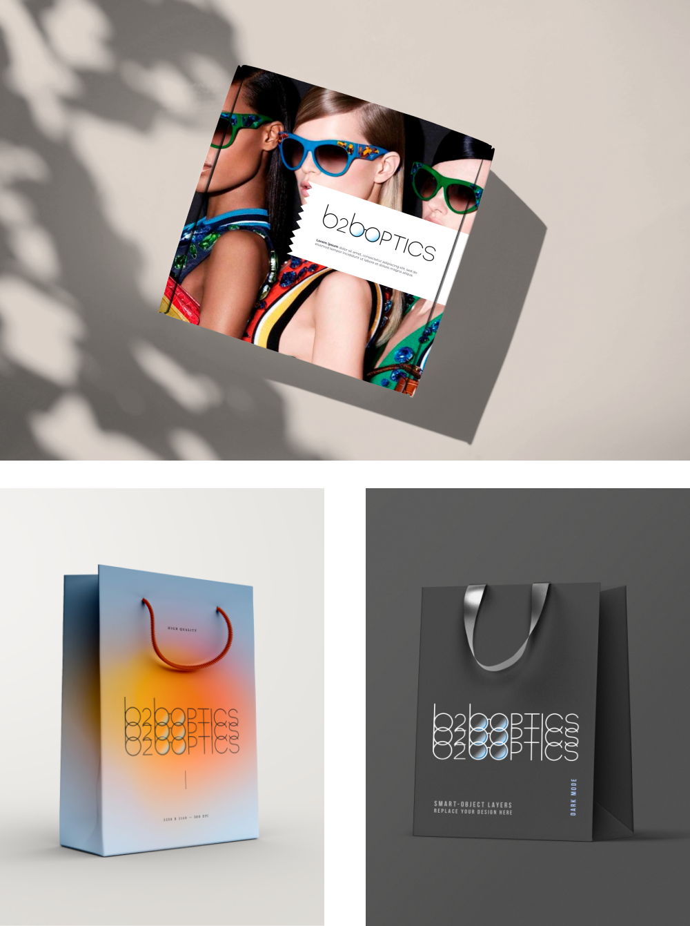
Logotype for an online marketplace in the optics industry.
The company was newly established and had no previous branding.
Design Brief
The customer preferred the logotype to include the brand’s name. The colour scheme was blue/teal.
The logotype had to be professional, fresh and clean.
The developed brand was going to be used mainly for visual styling of an online optics marketplace and secondary for conference booths and promotional materials. The brand underwent several iterations of tryouts in order to clean up the vision.
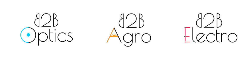
Initial Versions
I created the first takes with another request in mind – to think of the brand as extendable – optics marketplace, agro marketplace etc.
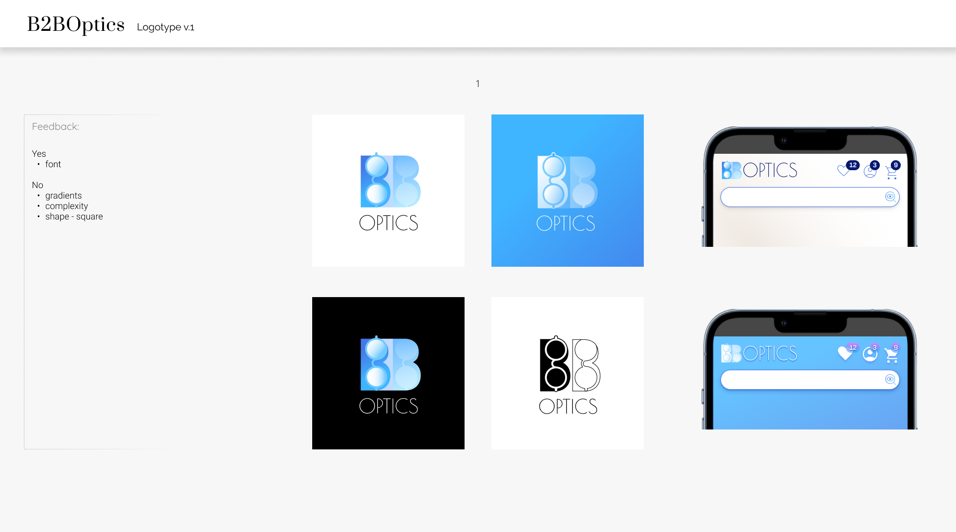
V.1 – V.3
For each step of the evolution I included 3-4 logotype variants, where for each variant I created it’s own card, including in the card colour options, brief mockup, the feedback that has been accounted for and what new feedback was received.
Final Version
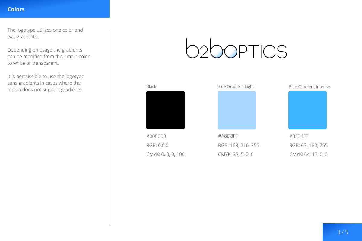
When the final version was approved by the client I created a Brand Guide to go along with it. Deliverables included vector and raster versions of the logotype and several mockups.